
Thursday, 19 December 2013

Thursday, 12 December 2013
Thursday, 5 December 2013
5 Shoe Pictures


The lighting on all of the pictures is the same, one light was lower on the left and the other light was higher on the right.
Next lesson:
Next lesson I will finish the photography for the lighting workshop.
I will also take photos for the final poster for the shoe advertisement.
The final thing i will do next lesson is
Thursday, 21 November 2013
Shoes design/ mind map

Thursday, 14 November 2013
Analysis of a trainer advert
2: The product that is being advertised is a pair trainers
3:The shoes are representing a heat
4:The main feature would be the heart made of shoes
5: To make the product look better
6:the theme of the advert is that the shoes can help you improve your health
7:it impacts the products style by saying it would improve your health
8:The target audience is athletes
9:The heart and the bottles behind it would attract athletes
10: They have used photoshop and composite images
11: I would show somebody using the shoe.

1:The function of tis advert is for the shoes
2: The product is for shoes
3: Paint is being thrown at the shoe
4: The main feature of the advert would be the shoe covered in paint
5:To show that it is a advert for a trainer
6:The theme of the advert is to show that shoes are just for being comfortable and not sport
7:The target audience would be teenagers
8: It reflects the style of the shoe because it suits the target audience
9:The shoe being covered in paint looks quite cool so teenagers would buy them
10:They used photoshop to create this image
11: I wouldn't use paint and would just leave it plain.

1:The function of this advert would be for shoes.
2:the product are trainers
3:The shoes are being used as a wall to protect from bullets
4: the main feature would be the wall made of shoes
5: To show that they are shoes
6: Theme is that the shoes can absorb impact
7:The target audience would be 20-40 year olds
8:it reflects the style because they are tough shoes
9: Using shoes as a barrier could show that the target audience would use the shoes more often
10: Photoshop and some photography were used
11: i would shoe the shoe being put under a lot damage to show they can stand a lot damage.
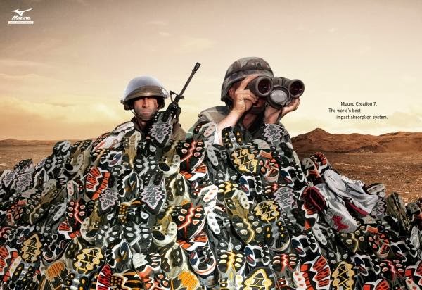
You have listed the visual element very well and have used them for examples in different questions, the 3rd image is the best from you're view because it is showing the strength of the trainers, and the use of the shoe.


Thursday, 7 November 2013
Photoshop vs Illustrator
Illustrator was originally used for the logo side of graphical design but now illustrator is used as a tool for graphic designers and digital artists to produce different types of digital media. Photoshop was originally created for photographers so they can edit different photos and images, that is why its called photoshop.
Photoshop uses pixels and is on a vector.

Times Square composite
1: First you open photoshop click new- name the file- switch to landscape.
2: Secondly you go onto the internet and find a background image that you like then you add another layer and add another image (the one you want to composite).

3: Next you make the image disappear by clicking on the layers menu, making the first box white and the second on black.


2: Secondly you go onto the internet and find a background image that you like then you add another layer and add another image (the one you want to composite).

3: Next you make the image disappear by clicking on the layers menu, making the first box white and the second on black.
4: Next you change your cursor to the paint tool and click on the white box, the white box makes the image appear and the black one gets rid of it. Make sure you turn your opacity to about 25-35 to make it more precise.

Finished Product

Ford logo timeline write up

2: When you open illustrator click: file- new- Name your file and change the file to landscape if you need to.

3: To make a timeline either draw arrows, get a picture off the internet and join them up using text boxes and arrows or draw a completely new design using the brush tools.

4: To add info make text boxes and add the information and images.
Thursday, 26 September 2013
What is branding and marketing
What is branding\ marketing of a company or product?
-Creating a unique name and logo for a product in the consumers' mind.
-Using different types of media and ways of advertising a product ; Advertising Shells(bus shelters), TV, Billboards and cinemas.
-Marketing is when a company promote a product they want to sell, Promotions, logos etc.
-Creating a unique name and logo for a product in the consumers' mind.
-Using different types of media and ways of advertising a product ; Advertising Shells(bus shelters), TV, Billboards and cinemas.
-Marketing is when a company promote a product they want to sell, Promotions, logos etc.
Logo Research
Volition: Volition is a big games company that developed the Saints Row series, their logo is a big capital V with a face in the centre , the logo's colour varies between games but when it is on its own and not in a game it is always black. The font is big and bold but is not original.


Red Bull: The red bull logo is unique and bright the logo is two red bulls, where the name came from, charging at each other. the logo catches your eye and stands out very easily the logo is also good because it tells the buyer\consumer what they are buying.
Coca Cola: Coca Cola's logo is VERY well known because its been around for a very long time. the colours have always been the same and the font has also never changed before. Cokes font suits the time it was created and looks like it was first hand drawn then printed and the copied using computers. Coca Cola is aimed at everyone from Children to adults, the only thing that has changed about Coca Colas image has been the bottle, the bottle has changed from glass to plastic but the glass bottle will never be forgotten because it is classic and timeless.
Subscribe to:
Posts (Atom)